[vc_row][vc_column][vc_column_text]Over the course of a hundred nights, a hundred years ago, a dark figure heaved bag after heavy bag off the Hammersmith Bridge into the River Thames.
 The man was T.J. Cobden Sanderson, founder of Doves Press and mastermind of the elegant Dove typeface that graced the five volumes of the Doves Bible and dozens of other elegant letterpress books. Sanderson was a friend of William Morris; at the end of the 19th century, he had christened the Arts & Craft movement that desperately sought to shore up traditional craftsmanship against the rising tide of Industrialism.
Through the summer of 1916, Sanderson dumped hundreds of pounds of type into the river because death by drowning, he believed, was better than seeing his typeface sold into the slavery of mechanical printing.
Raised from the Dead
 A century later, Robert Green, a digital type designer, dredged up hundreds of rusted bits of Doves type. Green has spent a lifetime researching the lost typeface, and has recreated it as “the Doves Type,” available at Typespec.
Sanderson’s Doves was based on a late 15th century Venetian type, developed not too long after Gutenberg looked to Italian handwriting for the inspiration for his first movable letters.
Type designers, it seems, have always been backward-looking.
As Frederic W. Goudy said, “The old fellows had the good ideas.”
Distinction and Beauty
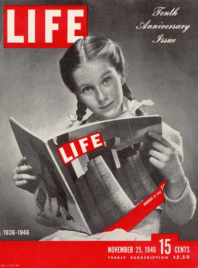 Goudy was a household name in print shops in the first half of the twentieth century. From 1915 to 1940, he drew more than 125 distinct typefaces, including the inside type for Life magazine. Goudy Old Style, he claimed, was inspired by the lettering on a Hans Holbein painting.
Goudy drew his typefaces freehand, without a compass, a straight-edge, or a French curve. “Printing is essentially a utilitarian art,” he said, “yet even utilitarianism may include distinction and beauty.”
About Face
What, exactly, is a typeface?
A typeface is the design of a particular alphabet.
A font is a collection of characters—capital letters, lowercase letters, numerals,and punctuation marks—rendered in one particular size and style. A typeface is usually available in several different fonts, including 12 pt, 10 pt, boldface, italic, Roman.
Confused? No wonder. Your Word pull-down menu has a tab called “Font” that offers hundreds of typefaces. You create the fonts yourself with the italic, bold, and sizing functions on your keyboard.
The Face that Launched a Thousand Quips
 Today, even six-year-olds are conversant in typefaces. Coca-Cola and Pepsi have always known that typeface matters, but now Four Men and a Truck and the local cupcakery are aware of it, too, and so is the student formatting her résumé for her first job application and the little boy hammering out invitations to his Hallowe’en party.
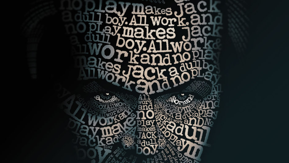
When Comic Sans was released in 1995, some type aficionados were so outraged they set up BanComicSans.com, where they sold anti-Comic Sans mugs and T-shirts to help finance a documentary called Comic Sans; Or, the Most Hated Font in the World.
Comic Sans Must Die went further. It deconstructed the face, glyph by glyph, until the typeface was finally declared officially dead on December 5, 2012. You can witness its demise at ComicSansMustDie.tumblr.com.
 But check the pull-down font menu on your computer: I bet Comic Sans is still there, with its goofy round, erratic letters that look like a child’s handprinted sign for selling lemonade at the curb. On Orange Is the New Black, Piper uses it for her prison newsletter. Pope Benedict XVI used it for the tag lines in his online papal photo album. His resignation letter is there, too, printed in the same innocently charming Comic Sans.
Julia Roberts vs. Uma Thurman
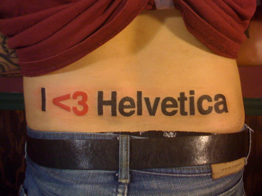 I remember firing up my first computer and being vaguely disappointed at the utilitarian Helvetica typeface, but I wouldn’t have gone so far as type designer Bruno Maag, who calls Helvetica a “cultural blight. If you think of ice cream, it [Helvetica] is a cheap, nasty, supermarket brand made of water, substitutes, and vegetable fats.”
Mike Battista, a blogger at Phronk.com, champions Univers, also a Swiss design. “There’s no fuss and schmuss about it, it’s a clean, tight design. If Helvetica is Julia Roberts—pretty enough—then Univers is Uma Thurman—really cool.”
And the Winner is . . .
 Typeface and typography—the art and technique of arranging typeface letters to make written language legible, readable, and appealing—can speak volumes. They won’t change the meaning of a text, but they can give the words a unique tone. They can even make us read words differently.
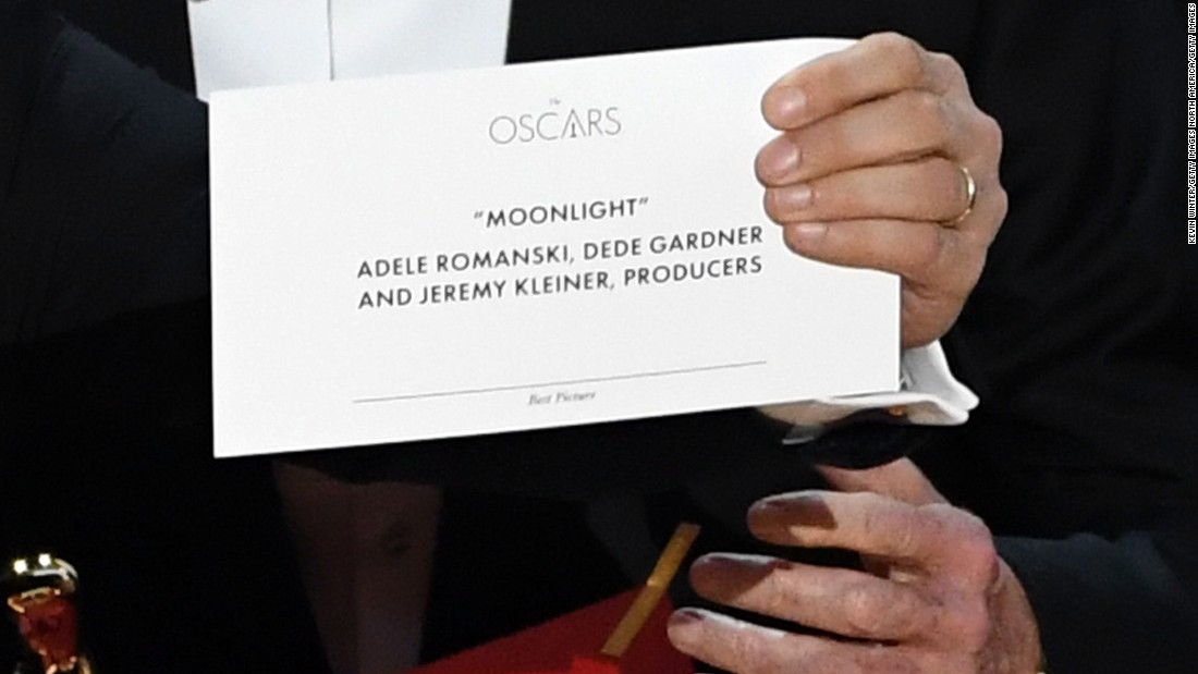
Just ask Warren Beatty. His befuddled squint at the printed card he lifted from the envelope is now seared into Oscar history. The typography on that card was so bad, it took the poor man several minutes to realize that he’d been handed the wrong card and that the lovely Faye Dunaway had announced the wrong winner. No wonder: the category “Best Picture” is almost illegible in teensy-weensy script way down at the bottom.
Not Finished Until it’s Read
As a writer, I believe in the saying that a book isn’t finished until it’s read, until the explosions that go off in my mind are set off in a new way in the mind of the person reading my words. In this digital age, a book isn’t fully designed, either, until the ereader or tablet is in the reader’s hands, until they’ve gone to Settings and adjusted the face and font to suit themselves.
Writing took ideas out of the head and turned them into objects built of words. As the poet-typographer Robert Bringhurst puts it, “Writing domesticated language.” The alphabet condensed complex images into 26 shapes that have sound and meaning only because we have agreed they do. Mechanical type substituted individually drawn letters for standard shapes that could be mass produced.
Now digitization has made words ephemeral, without any physical substance at all.
These days, no one has to dump a typeface into the river. A stroke of a key will make it disappear.[vc_row][vc_column][vc_column_text][/vc_column_text][/vc_column][/vc_row][vc_row][vc_column][vc_separator][vc_column_text css=”.vc_custom_1477364431886{padding-top: 10px !important;padding-right: 10px !important;padding-bottom: 10px !important;padding-left: 10px !important;background-color: #ededed !important;background-position: center !important;background-repeat: no-repeat !important;background-size: cover !important;border-radius: 2px !important;}”]
What’s your favourite typeface?
[/vc_column_text][vc_separator][/vc_column][/vc_row]
8 Comments
Love this piece, Merilyn. I’m a dyed-in-the-wool Times New Roman girl for my own work– somehow nothing else looks fully “done.”
Thanks, Alyssa. One of my rituals starting a new book is to choose a fresh typeface for the project. I’ve written in Palatino, Avenir Book, even tried Comic Sans! For Gutenberg’s Fingerprint, I wrote each chapter in a different typeface: Papyrus for Paper, Franklin for Type: you get the picture. But the final stage is always to flip the manuscript back into good old Times New Roman before I submit. Like you, that’s my cue that it’s done.
Calibri, always!!! Thanks Merilyn, this was an interesting read.
Ah, a sans-serif fan! Do your friends also prefer footless faces? I’ve often wondered if a generation raised on Helvetica and Arial would eschew the serifs that the typewriter generation cut their teeth on.
Call me old-fashioned but I’ve always been drawn to Goudy. I love the lack of straight lines and the sensual and subtle curves that serve in their place. Time and again in my career as a printer my choice (if and when I had one) was to move into the Goudy family. My graphic design persons would laugh at me and the comment was often, “I should have known you’d want Goudy.” A face that was easily read in text and also served well for heading, titles or simple stand-alone words was so much a part of my life. I even used it as the face of my business. Whenever the word Ritz was used, I made sure the font was Goudy. (I just tried to change the word Ritz into Goudy – I guess I’m not as good as I used to be or it would now stand out from the rest of this comment). My love affair with Goudy started when first I started my work in the print industry. We had California job cases with 18 and 24 point Goudy Bold that was almost older than everyone in the shop added together. It was beaten. Scarred and crushed to the extent that some letters had to be shimmed underneath to gain type-height once again, I just loved to use it. Thanks Merilyn, for triggering those memories.
It was a treat to learn about Goudy and the huge influence he had. What a creative guy! When Hugh Barclay set the Paradise Project, he chose Garamond but I really loved the Goudy Old Style open face (the one with an engraved line along the left side of the letter that prints like a white shadow). I love the way Goudy’s biographer, Peter Beilenson, describes the face: “a happy blend of French suavity and Italian fullness, marred by the supposed commercial practicality of shortened descenders.” Makes it sound like wine! And you’ll appreciate this tidbit: the very first design patent issued in the United States—U.S. Patent D1—was for a “new and improved printing type.”
Sorry to hog the comments but there is one more font about which I am very excited.
https://www.dyslexiefont.com/en/ will take you to a fairly new typeface website intended specifically for persons with dyslexia. The rest of us are very lucky that the obstacle to communication experienced by dyslexics is not one we face.
I hope designers and writers might consider the use of this face wherever possible.
This is so interesting! Thank you for pointing us to dyslexiefont.